Tuesday 20 March 2012
Monday 19 March 2012


Friday 16 March 2012
TASK 1: In what ways do your media products use, develop or challenge forms and conventions of real media products?
Camera
CHALLENGES- As he writes on the perspect we wanted to create the feeling for the audience, as if he was writing directly on the camera. There are no performance elements, neither does it contribute to a narrative.
At the beginning of our music video we have him out of focuse and the audience sees the title. As we have a focus pull to him singing, the audience is introduced to the title of the song, whoch is not typical for a music video. It challenges conventions of other music videos and artists, seen that Peter & The Wolf cares more about his ideas and music, istead of showing off in front of an audience and presenting as much as they can.
At the beginning of our music video we have him out of focuse and the audience sees the title. As we have a focus pull to him singing, the audience is introduced to the title of the song, whoch is not typical for a music video. It challenges conventions of other music videos and artists, seen that Peter & The Wolf cares more about his ideas and music, istead of showing off in front of an audience and presenting as much as they can.

Style
CHALLENGES – because these shots are more filmic and different than a usual music video. There are no special effects, narrative or performance, as he is only shown walking up the stairs.
Seen that we wanted our music video to follow the genre, which is Indie, we experimented more with our shots. We used close ups and other shots on his hands, feet and over all on his movement, which we thought is more important to us. In other music videos, they probably sell on looks and performance in the video, which we didn't focus on, and therefore I think it challenged the convention.
Dancing
DEVELOPS – dancers are often used in music videos. The different to our music video is, that they normally are rather commercial dancers that dance for or together with the artist and therefore the song is dancy. In our video our ballerina is part of the story. This is why we neither challenge nor use this convention but we develop the dancer idea and put it into a completely different content and music genre.
In the music video of Beyonce, "Love On Top", she has several men as background dancers, which immediately show, that it sells to a specific RnB/girls audience. The dance style is rather sexy and up to beat and contrasts our sophisticated ballerina, which is a more artistic element in our music video and shows the seriousness of it.
In the music video of Beyonce, "Love On Top", she has several men as background dancers, which immediately show, that it sells to a specific RnB/girls audience. The dance style is rather sexy and up to beat and contrasts our sophisticated ballerina, which is a more artistic element in our music video and shows the seriousness of it.


Performance a)
DEVELOPS – it develops the convention, as we see the artist perform but instead of acting it he just stands still against the wall and doesn’t even look into a camera. This specific shot conveys to our genre. The artist doesn't sing into the camera and his audience, instead he stands still, leaning against a wall and concentrating on the lyrics and not on his looks or performance. This might contrast Katy Perry's music video to California Girls, where she uses a lot of props and people to sell it to her audience. She also sings to the camera, which Peter & The Wolf doesn't do, because we keep it simple.

USES – it uses the convention as we show the artist playing his instrument, or rather see close ups of his hands playing which is commonly used in music videos that are by brands or artists that play their music themselves. We did this in order that the audience sees the connection/link between the artist and his love for music.
The performance is our key convention. Just that at some point in the video it is playing itself, which seems rather sophisticated. We took a normal element and subverted it.

Special effects
USES - it uses the convention especially nowadays as the technology gets better and better and more artists use CGI in their videos to add value and the level of interest , or enhance the look of the video. We used simple and not many special effects. Not to go with today's technology, but I think it goes with our theme and genre.

2 PANELs OF DIGIPAK
- The font CHALLENGES convetions of almbum cover styles because we kept it really realistic by using the actual artist’s writing and scribbling to underline the genre of Peter & The Wolf, which is Indie. This specific font makes our digipak more realistic and personal.
- We also use the same background wallpaper as in the video ionstead of coming up with a whole new fancy design, which creates a link between the artist in the video and the artist on the cover.
- Also, we don’t use and photos except for one Polaroid which CHALLENGES the convention of using new technology to edit photos. It is kept very simple and has no photoshop changes.


The Poster

- Simple, no photoshoped changes made.
- Using a known photo from the music video we remind the audience of it and maybe encourage customers to create a style or unique selling point.
- It also refers back to the genre of the music, which is Indie.
- Eg her we can see how RnB/HipHop uses “sex sells” to promote their music.

How is the artist represented as a person?
He stares melancholy out of the window into the wide world. Which refers to his genre.
Whereas “The Prodigy” stare with an aggressive expression right into the camera/audience conveying the feel that the band and their music is though and loud and intrusive. Also they want to take over the world with their music, whereas Peter just cares about his music because it makes him happier and it’s not about marketing himself. (This is just seen as his reputuition as an artist, obviously he wants his music to sell good.)


Thursday 15 March 2012
EVALUATION TASK 2: How effective is the combination of your main product and ancillary texts ?
The script:
• Richard Dyer’s theory of star image
• What’s his star image?
• How is his this sold through video, digipak and poster?
• How do they work together?
Richard Dyer&Star image
Richard Dyer is an English academic who specialises in cinema and analysing the extraordinary world of ‘stars’ in the entertainment industry. The term star refers to artists who live their life publicly due to their work and are therefore seen as almost superficial creatures. He argues: ‘Stars are commodities produced and consumed on the strength of their meanings’ making the point that the artists’ image needs to be well established which is done through the marketing campaign around the music. The star images consist of particular characteristics of the artists, for example rebellious/anti-authoritarian, plus their looks and their music genre. Sometimes, the background of the artist is very important as it can contribute to the image, giving reason for certain behaviours. A pop-star is different to a performer, Dyer claims, as a star is promoted to this status by management and has an identity or persona which is not restricted solely to their musicianship.
A star is constructed out of 2 paradoxes, Dyer says. Number one is the star has to be simultanously ordinary and extraordinary, so that fans can look up to them and adore them but also relate to them as human beings. Paradox number two says that the star has to be absent and present at the same time, the fans should feel close to them, have posters on the wall and watch interviews, but also know in the back of their mind that they would never get to know the star they admire. This is how the star image works but it is of course different applied depending on what kind of artist is dealt with.
Identify the artist & image/3 key qualities of image
Peter & The Wolf is an indie artist and therefore I would describe the constituent features of his star image as creative/talented, sophisticated, intelligent and original. Because of the importance of creating a star image we created a campaign for Peter & The Wolf to sell both his music and image. This includes a music video alongside the new single, a digipak of the new album and a poster to promote the album release.
These three products promote the star in different ways each but overrall work together.
Identify our target audience
The audience we target with our artist is aged between 17 and 35 years, male and female, and a more intellectual and middle-classed audience. As it’s a calm and easy music sung by an unintrusive singer it will appeal to an group of people that might be occupied with a job and listen to calming background music, or to younger people that are rather individual and don’t like following the mainstream music.
How are these qualities shown?
Our main product is a music video which is supposed to promote the song by creating a visual. This encourages repeated consumption and brings it to the grand advertising platform, television. Our aim was to make a music video that was original and different. It is artier and more melancholic than most videos which tend to be very fast paced and colorful. We focused on strong, well composed visuals, such as the shot when the artist stands behind the perspex covered in scribbles and the stark contrast between the ballerina in the white room and the color of her lips and mask. These visuals aim to create a special atmosphere and give the music video an intense, serious and artistic mood that provokes emotions and thoughts in the viewer. We made these creative decisions to emphasize Peter’s own image and style, which is a calm, passionate musician who seems not to care about the world. The muted colors, naturalistic lighting and a realistic environment promote the idea that Peter might be slightly mad or depressed. The focus is only on Peter which reinforces that he is a solo artist.
The digipak was created with the intention of maintaining the same style as the music video. We did this in order to construct a unique selling point and a face of the whole campaign as he is a new artist. For example, we used the artist’s hand writing for the font of the cd cover and inside layout just like we used his scribbling in the music video as an element in the music video. This makes the digipak more personal and individual. We also used the red wallpaper that was seen in the video as part of the layout in the album which contributes to our aim to create the face of the campaign. All the elements of the digipak help to build and sell the artist’s star image.
The poster’s purpose is to advertise the artist, in particular his new album that includes the music video song. The photo is chosen from a shot we took on set and strongly conveys the mood of the music video as well as reinforcing Peter’s image and personality of being sophisticated, serious and deep.
All of these different media products work together to construct the image of Peter & The Wolf by creating a face and look for the artist which is substantial and stays in consumers heads. As his music is not mainstream, the target audience is a niche audience that is already interested in indie music. All of these produced media are made in order to promote and sell his music which is the final goal!
Comparison with real artists
In terms of image we took some inspiration from artists such as Bright Eyes and Patrick Wolf, who are independent alternative musicians that have similar personalities and star image to our artist Peter and the Wolf. Those musicians are not appealing for a wider audience.
We got inspired by music videos from Birdy’s cover version of Skinny Love and Patrick Wolf’s ‘House’ for our location shots. The main inspiration for our studio shots came from Bright Eyes video ‘Lucky Easy Free’ which we interpreted into our concept
Tuesday 13 March 2012
Tuesday 6 March 2012
EVALUATION TASK 4 : How did you use new media technologies uin the construction and research, planning and evaluating stages?
The script:
In our music video we shot on two locations, one of them, and the first one you will see was shot in the studio.
The studio setting of our music video was filmed in a warmly lit environment, and when we got around to editing the video we realised that we didn’t like how orange the footage had come out. In order to change this we used a programme called ‘Color’ to pull down the amount of reds in the footage leaving it with the cool blue colouring. This gives a similar atmosphere to the other examples of indie films we had watched, from artists like Bright Eyes and Patrick Wolf that we looked at on online sources such as YouTube, MySPace, google, soundcloud, iTunes and official websites to make research into the indie music industry to collect inspiration and knowledge about existing artists and especially their music videos which contributed to some stylistic ideas of our video.
For most shots in the studio we used a Sony F3 camera with a prime lens as it is very useful for so called beauty shots (For smooth skin etc.). For the focus pulls we had to change the lens as you cannot zoom with it.
When changing our location to the house we noticed that the lighting was quite warm again and therefore we put some blue tones on top of the lights to make the images look colder. Again we used the Sony F3 camera, because of its clarity and amount of details when having a close ups. When shooting the ballerina we took the Sony NX5 camera, which does not have the same quality like the Sony F3 one but it was useful for us because we were shooting two scenes at a time in order to get more material done in less time. So while one part of our group was shooting Peter, the other group was shooting the ballerina dance sequence. This time we did not have the equipment of a CD player so that we had to use our phones in order to make use of a playback.
For the special effects when bringing the flowers back to life we used After Effects in Final Cut Pro which allowed us to cut out Peter and arrange the background so that it the fading into the live flowers look ‘natural’ to us. We put everything back in place and created a change that look ‘right’ for our eyes. In order to lead the viewers look we made use of a zoom as well. This process is called Masking.
After this scene we had another bit where we made use of after effects. That was when he is finding the Polaroid picture between the books which is then starting to move. In order to create the impression of a moving image we had to do a similar thing to the still image in After Effects. We used an empty Polaroid so that we were able to cut out the black bit and place the video clip into the empty frame.
Even though Peter tried to be still, his hand was still moving a bit, therefore we had to freeze the image (his hand) and only have the inserted clip moving. The interest of the audience will be focused on the clip so that they may not notice the fact that we froze the other image. Over all we had to images in one.
Looking at the very last bit of our video you might notice that we had to slow him down a bit when walking out of the door. Again we did that with the help of Final Cut Pro. (Slowmotion)
Still of digipak:
We wanted to repeat the theme of having a Polaroid in the Digi pack, because we thought it could be one of his trademarks that is going to be repeated throughout his image. Therefore we took a photograph of him wearing a wolf hat and change the colours in Photoshop so that it had a vintage style to it. After having turned the photograph into an old fashioned picture we inserted the image into a digital Polaroid frame. On the front cover we decided to leave it with a Blanc front cover with nothing on it but the Polaroid and on the back we did the same thing but with the back of a Polaroid. On the back we had written the tracks of the CD in his handwriting. The inside included lots of his personal writings that were thanking the people that supported him. In order to make it personal we had him coming in again and he had to write some the track list and the tank you … list. After he had written all that we scanned it into the computer so that we were able to work on it digitally and insert all the letters etc. into the Digi pack. On the other side of the cover, as well as on the CD itself we put in the wallpaper of the house setting. We took a picture with a Canon camera beforehand and then we did some colour changes as well in order to create this vintage look. In this case we made use of Lightroom which helped to change and contrast Hue and Saturation as well as the colour settings.
Show video diary:
On the set, we also made a short video diary t5o show some behind the scenes footage. We filmed this with an iPhone 4S and cut it on iMovie on a Mac.
Onto blog
• Pre-production: When we discovered…
• Onlining/offlining process
• Evaluation process and used technologies
Tuesday 13 December 2011
Editing Process
We started editing !! - post in progress
Here you can see us in the editing suite working on our pop video with final cut.

Here you can see us in the editing suite working on our pop video with final cut.

Call Sheet

This is our CALL SHEET of teh first shooting day. We did this, in order to organise our day. We printed a copy for everyone involved, so that the cast knows the schedule.
Thursday 24 November 2011
DIARY OF OUR MUSIC VIDEO SHOOT - PETER AND THE WOLF - FOREGROUND
beautifully - danke dass du's gemacht hast sieht supi aus xx Paulchen
EVUALUATION OF SHOOT DAY
Studio
On our first shooting day we filmed in the studio, the performance space. For that we had simply built a white box, with a door in it. We used a piano and a see through perspect.
At 1:30 pm we all got together and started getting all the things we needed together, the last preparations. We got the piano and tried to figure out where we could set it, in order to shoot a lot of different angles.
Then we run through the song with our main character, to see if he knows the words and to help him getting into it. We all sang with him, so that he musn‘t feel uncomfortable to perform in front of the whole shooting crew.
We then started shooting close ups from different angles of the piano. We therefore asked another student to learn the song, in order that we could shoot it for the performance. In the final project we then see our actor and cheat it so that it seems that the hands are his. It was very difficult to shoot on this piano, because it was only a piano shell, because otherwise we couldn‘t have carried it into the studio, without having to STIMMEn it again. It was a challenge, because some of the keys on the piano were stuck together, that means that if you press one key, more keys would play. Another rather difficult task for the person, who played the piano was, that because it was only a piano shell and not a proper piano, he couldn‘t hear himself play, so he had to remember the whole song in his mind. I think in the end it worked quite well, and we can cheat it in the editing and just cut the bad rushes out, but if we would do it again, we probably would need to organise a real piano, so that it makes it easier for the artist to play it.
As we then started with the real shoot, my group worked everywhere. I was the director, I was on the camera and I was on the sound. I learned a lot, because if you see a finished music video, you would never think that it takes so much effort, patience and detail in order to get something good out of it. Most of all I think I enjoyed being behind the camera, because you followed the DEVELOPMENT throughout.
We separated our shoot in different sections. First, we got different angles, such as wide shots, close ups, medium shots, high and low angle shots, of the piano and our artist singing to it. I wouldn‘t say we had trouble, but it would have been better if we had made an exact shotlist, so that we knew what we were doing at what time. We now have all shots we needed, but it took a lot of time figuring out what we want and from which angle.
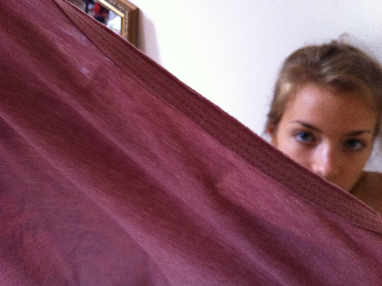
Secondly, the part where he drew on the perspect. It was a huge glass wall in front of the camera, where the artist wrote onto, so that it seem that he is writing directly on the camera. He wrote the name of the song and the band backwards, so that the audience can read it, but the little bits and words of the lyrics he wrote in a normal way, so that the audience can‘t really read it. If we would do it again, I would probably sit down with the artist and make him write words backwards so that we can read it. But I guess it works really well as a visual. We had only planned, shooting him writing onto the wall, but then we got the idea to let him sing behind the wall. He wrote „Foreground“ big on the perspect and as he starts singing, we focus PULLED between him and the wall. It looks as if it fades onto him, which worked really well.
One of the things we really wanted to do, but we couldn‘t, because of time, is throwing colour on him. We bought purple colour, which we wanted to throw on him from two sides, and that the colour then drops of him and the perspect in front of him. Thank god, it wasn‘t one of our important things, but seen that our video is based on visuals, it would have probably looked good.
Our set was very simple, and therefore during the shoot we got an idea, to turn the piano onto its side. He leaned onto it and sung next to it.
One advantage, that we only had the shell of the piano, was that in the back it was open, so we could stand behind the piano and play the keys. One shot was, where we had a close up on the keys, and it seemed as if the keys played themselfes.
Another shot, which looked really great was when we had the artist lean over the camera and played the keys, so that we could only see his palms. We panned from left to right.
Seen that our set was very plain, we could have probably used more things surrounding it. We had the idea of a balloon, just floating from side to side. Just for the visual effect. Now, we decided to project words and maybe colour onto the walls with after effects, which could look amazing and more interesting to watch.


Leith Hill - The House
One week, after our shoot in the studio, we then moved to a boarding house, which is now empty and not used. We there had different rooms, where we follow the artist around. We again, concentrated on visuals, and had only a few singing spaces.
The idea of the house was that it was his mind. The studio, was more or less a cell where he was trapped in, and, everything what is going on in the house is his imagination. He escapes into this wonderful world, where he creates different things, and make things come „alive“ more or less.
We had diffenrent things such as an old painting, where the colour comes back after he touches it or other things, he brings back to „life“ again. If we would do the shoot again, I would say that we should have been better prepared with this things. Our footage is very good, I believe, but we didn‘t think through everything in detail, in order to let the audience understand this metamorphose of different things.
Things that worked well, was for example the ballerinascene. We had an old music box standing on the floor. After he spun the BUTTON the ballerina in it started spinning, and we had a real ballerina „coming out“ of it and dancing. There again, he brought her back to life. In the editing process, we can cut this well together that it really seems, that the ballerina in the box is the ballerina dancing in front of the window. To make it seem real we, at first, shot an extreme close up of the music box and the foot of the real ballerina coming out. When we edit we would then probably cut to a medium or wide shot to show her dancing in front of the window.
Another really nice shot is an over shoulder shot of him looking ou of window, the right hand placed on a window. We also have a shot outside of him looking straight into the camera. The rather tricky bit here was to pay attentions to the reflections in the window. As we were shooting this medium shot of him looking out, we saw us and trees in the window, which distracts from the artist. We could cheat us and the camera out of the frame but we couldn‘t cheat the tress out.
Something what worked really well, was the book scene, where he looks into a book nd a polaroid picture falls out. We have a lot of different shots and angles from it, such as high and low angle shots, a close up of the polaroid landing on the floor. A very nice shot there was when he was almost „hugging the camera“. He stood behind the camera, he picked the polaroid up and is looking at it. It is a very different shot and it seems as if the camera was attached to his neck, looking down on the book and picture.
In the house we had a very beautiful staircase, which we wanted to use. We thought of fabrics or balloons falling down, while he is walking up. The final idea were, leaves falling down, but we couldn‘t use them because it was raining the night before and therefore we wouldn‘t have such a nice visual effect of the dropping. If we would shoot again, I think we would need to organise ourselves better, because we left it until the last moment and din‘t think of it. We now have him walking up the stairs, without nothing, which still looks good because we have different shots of that, but it would have been even better with leaves, balloons or any other action happening.
The first shot when we arrived was the corridor shot. We wanted him to walk up to a door. The door is opening while he is walking up to it, and behind it, we can see bright light, which should be a metaphor for the studio, he is either drawn back to it or wants to escape from it. In the end of the song we have a choir, and we will match this „walking to the bright light“ to it. The only problem was, when we arrived, that the door at the end was closed, and so we had to use a different door, which made it more difficult to film. We had him walking towards the camera, and we will then cut to the different side, where we see him walking away from the camera and towards the light, which were two red heads. I believe, if we would have to film again, that we should have tried opening the door, before the shooting day to make sure that it works. Bur now, looking back at the day and on this special scene, the shot looks much more interesting, because he is walking towards and away from the camera, which is very nice.
SOmething, which is a big relief for us, is that our artist was much more relaxed on this day because he knew us more and this made it easier to shoot with him.
 Overall I think our music video shoot was a big success. We have gone through a lot of difficulties and we had to start from the beginning a few times. Thinking of it now although, I believe that it‘s very good. Obviously somethings could have gone better, but we always found a way to resolve the task. Also I‘m very pround of my group. We all worked very hard on it and we all helped where we could to make it possible. I‘m sure that if we continue to work on it, that the final project will be very good.


Saturday 22 October 2011
Sunday 16 October 2011
Feedback
There is a good sense here of the progression of your concept, which has gone through a few phases to reach where you are now! You have some good detail in your research and planning materials to document this process and there is a clear sense of audience and institutional contexts. You do need to upload the set designs which were drawn out and perhaps the mood boards as well to complete this week's package.
James
James
Friday 14 October 2011
SCHEDULE
The first location is going to be in the studio, where the performance on the piano and him singing, is going to take place.
In the studio we can see a black, old looking piano, a white door, which we won’t see with the over exposed lighting, a sheet of glass, where he is writing on. When he starts writing, this is the first time that the audience is being introduced to the colour purple, which we will see throughout the video on different props and ion different locations.

- Set-up 1: We see Peter entering the white cell and his piano
- Set-up 2: When we hear the first “bling” sound the piano keys play by themselves. We see purple finger marks on the piano keys.
- Set-up 3: Peter walking to the glass and writing the name of the band on it in purple.
- Set-up 3: White walls are getting coloured/ Peter body painting, painting on glass, throwing himself on the walls.
Shot numbers from storyboard
1-10(dissolve into house location), 12, 15, 16, 17, 31, 32, 33.
The second location will be the house, which should be seen as a metaphor for his mind. It is his own world, where he can do whatever he wants and has the power of rejuvenating things e.g Bringing dead flowers alive, bringing the ballerina in the box alive.
- Set-up 1: We will se an over shoulder shot of his head, looking out the window, the world outside the house is out of focus. As the lyrics say “Palms in the middle, hands in the middle” we can see him putting his palm on the window and it cuts to the outside, where we can see him doing this action. He then leaves purple hand marks on the window, as he walks away.
- Set-up 2: This set up is going to be the room with the ballerina. It is quite empty and we will only see a book shelf and a window, which is probably blocked with bars of wood. As we cut to an extreme close up of a ballerina in the box without, who is missing one arm, the artist is going to pick up the arm and fix it. As he does that, we see that he leaves purple marks on her. It the cuts to the real ballerina with a purple arm.
- Set-up 3: The third set-up is going to be in front of a fire place, rocket chair and painting. The painting hangs slanted, and as he puts it straight and the colours of the painting refresh, we again see purple marks on the frame.
- Set-up 4: Rotten flowers. The vase is fallen over with rotten flowers and as he puts them back up the flowers become alive.
- Set-up 5: Rejuvenation
- Set-up 6: Rejuvenation
- Set-up 7: Set-up seven is going to take place in the long corridor. He walks towards a door where bright light shines trough, which should leave the audience thinking that it is the studio. As he walks down the corridor and streaks along the wallpaper, he again leaves colour on them.


CAST
CAST
For our main character, we would like to use a rather skinny and good looking guy. We want him to represent the indie and rather alternative style. This means that within his look, we want to still show a bit of weirdness and vulnerability, although still attractive.


For our female role, which is the ballerina, we would like to use Paula, which is also part of the production team. We think that she has the right look for it and seen that she is a dancer, she would be perfect for it.
Storyboard Animatic and Evaluation
On the video above you can see my group’s storyboard. We did that in order to see how long every shot lasts and how the end result could be to eventually change bits of it.
After we kind of had an idea how our shots should look like and what we want in our music video, we started to draw our storyboard. We named our shots/movement and tried to match it with the original track. Then we filmed it and in the editing process we started to match our shots to the action.
I think it gave us a good overview of what we actually want to rechieve and what we have to make better. I guess that by now we are much clearer what we want him to do in our second location and how we want to present this to the audience. From the beginning on we wanted our video to be visually beautiful and in the past weeks we had to change ideas and our storyboard a lot of times. But we still want to concentrate on the picture a lot. Therefore our idea to rejuvenate different objects could work very well. We purposely chose two different locations, because one is “reality” and the other one in the house should represent his own worl, he crated. We therefore had to choose specific things and action that he could do in the house and just a simple performance stage. I guess lighting could help as two create a big contrast between both of them. A new idea, which we thought about after filming the storyboard, is that he opens a diary and it cuts to a Polaroid picture, which just fell out of it. We can see then see the picture moving and he sees himself in it, walking down a hill or simple with balloons in his hands.
What I learned from this task is that it is really important to create a storyboard, because it gives you proper ideas, how the overall result could look like. Also, we came up with more ideas, which I think will make our video, even more visual and interesting.
Tuesday 11 October 2011
PROP's AND COSTUME LIST

For our main male role we thought about two different styles of costume in two different locations.
In the first location we would like him to wera black laced up boots, black skinny jeans, a black “army style” jacket with collar and a whit simple T-Shirt.
In the second locations, which will be in the house(his mind), we thought about him wearing black skinny jeans, a navi long sleeve jumper with white stripes and bare feet. We wanted him to wear the striped T-Shirt in the studio as well, but seen that our lighting there is a bit over exposed, you couldn’t really see it then.
For our femal character in the video, which will be a ballerina, we want a plain tutu. Therefore we looked up some up online and we found a plain white tutu with a feather corsette, which would go very well, because the colours/light in the house will be simple and in a way dreamy.
The only props in the studio we want is a rather old looking piano, a white door and a long sheet of glass, where he will be writing on.
In the house we would like to use:
A doll or a ballerina in a box
Live flowers and dead flowers (transformation)
Light behind the door at the end of the corridor
Teacup
Purple paint, which we use throughout the video e.g on the wall, windows, doll, etc
Body Paint
Fruit and rotten fruit
A rocking chair
Curtains
Painting/old frame
Wolf hat
Strawberry Chupa Chup


Tuesday 27 September 2011
TIMELINE

Location: Studio
Action: Peter walking straight to camera
Shot/Movement: wide shot of Peter. Out of focus but as he comes closer to the camera he is in focus
(focus poll)

Location:Studi
Action: cheeky smile
Shot/Movement: extreme close up of his face
Timing: 0:1- 0:4

Location: Studio
Action: lifts his pen
Shot/Movement: medium shot
Timing: 0:4 - 0:8 seconds

Location: Studio
Action: writes Peter & The Wolf (pen is behind glass wall)
Shot/Movement: close up of his and and the pen
Timing: 0:8 - 0.20 seconds

Location: Studio
Action: facing the camera and taking off his T-shirt
Shot/Movement: wide shot
Edit transition: glass starts moving and Peter & The Wolf disappears
Timing: 0.20 - 0:30 seconds

Location: Studio
Action: painting himself
Shot/Movement: close up of chest, camera pans up from chest to face
Timing: 0:30 - 0:42 seconds

Location: Studio
Action: starring at camera and lying on the floor
Shot/Movement: extreme close up on face
Timing: 0:43 - 0:45 seconds

Location: Studio ( floor)
Action:
Shot/Movement: camera is zooming out on his face and starts turning
Timing: as he starts singing 0:45 - 0:57 seconds

Location: STudio
Action: pinning wet clothes on wall
Shot/Movement: high angle, medium shot
Timing: 0:57 - 1:04

Location: Studio
Action: pinning clothes "on" camera, DARK/purple
Shot/Movement: high angle
Timing: 1:04 - 1:10

Location: Studio, in washing machine
Action: he takes away the fabric in front of camera and suddenly we see his face in a different location
Shot/Movement: close up
Sound: ping
Timing: 1:10- 1:15

Location: Studio , wall
Action: we see wet, purple clothes hanging on wall
Shot/Movement: wide shot
Timing: 1:16 - 1: 18

Location: Studio, wall
Action: purple water dropping on the floor
Shot/Movement: extreme close up or close up
Timing: 1:18 - 1.21

Location: Studio, in front of glass
Action: drawing a part of a house, (walks out left)
Shot/Movement: medium shot, breaking rule of 3rds, zoom to drawing,
Timing: 1:21 - 1:27
Edit transition: dissolves

Location: House
Action:
Shot/Movement: establishing shot of room
Sound: "Foooreground..."
Edit transition: dissolve
Timing: 1:27-1:33

Location: House
Action: peter entering the frame
Shot/Movement:est. shot
Timing:1:33-1:40


Subscribe to:
Posts (Atom)