Tuesday, 27 September 2011

TIMELINE


Location: Studio
Action: Peter walking straight to camera
Shot/Movement: wide shot of Peter. Out of focus but as he comes closer to the camera he is in focus
(focus poll)


Location:Studi
Action: cheeky smile
Shot/Movement: extreme close up of his face
Timing: 0:1- 0:4


Location: Studio
Action: lifts his pen
Shot/Movement: medium shot
Timing: 0:4 - 0:8 seconds


Location: Studio
Action: writes Peter & The Wolf (pen is behind glass wall)
Shot/Movement: close up of his and and the pen
Timing: 0:8 - 0.20 seconds 


Location: Studio
Action: facing the camera and taking off his T-shirt
Shot/Movement: wide shot
Edit transition: glass starts moving and Peter & The Wolf disappears
Timing: 0.20 - 0:30 seconds


Location: Studio
Action: painting himself
Shot/Movement: close up of chest, camera pans up from chest to face
Timing: 0:30 - 0:42 seconds


Location: Studio
Action: starring at camera and lying on the floor
Shot/Movement: extreme close up on face
Timing: 0:43 - 0:45 seconds


Location: Studio ( floor) 
Action: 
Shot/Movement: camera is zooming out on his face and starts turning
Timing: as he starts singing 0:45 - 0:57 seconds


Location: STudio
Action: pinning wet clothes on wall 
Shot/Movement: high angle, medium shot
Timing: 0:57 - 1:04 


Location: Studio
Action: pinning clothes "on" camera, DARK/purple
Shot/Movement: high angle
Timing: 1:04 - 1:10


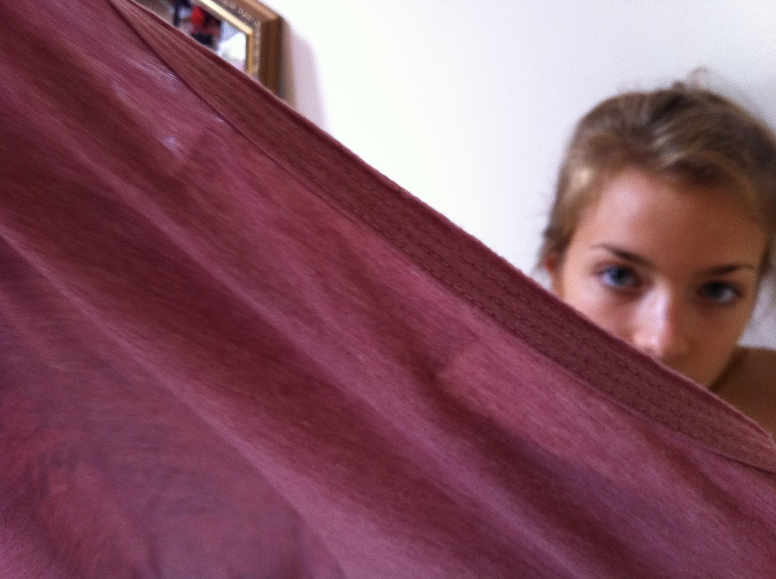
Location: Studio, in washing machine
Action: he takes away the fabric in front of camera and suddenly we see his face in a different location
Shot/Movement: close up
Sound: ping
Timing: 1:10- 1:15


Location: Studio , wall
Action: we see wet, purple clothes hanging on wall
Shot/Movement: wide shot
Timing: 1:16 - 1: 18


Location: Studio, wall
Action: purple water dropping on the floor
Shot/Movement: extreme close up or close up
Timing: 1:18 - 1.21


Location: Studio, in front of glass
Action: drawing a part of a house, (walks out left)
Shot/Movement: medium shot, breaking rule of 3rds, zoom to drawing, 
Timing: 1:21 - 1:27
Edit transition: dissolves 


Location: House
Action: 
Shot/Movement: establishing shot of room
Sound: "Foooreground..."
Edit transition: dissolve
Timing: 1:27-1:33


Location: House
Action: peter entering the frame
Shot/Movement:est. shot
Timing:1:33-1:40


Monday, 26 September 2011

PERMISSION LETTER


To Warp Records.

We are a group of A Level students working on an A Level project for a qualification in Media Studies. We are writing to request permission to use the following track as part of this project:

Grizzly Bear - Foreground

With your permission the track would be used as the accompaniment to a short form video that is made purely for assessment purposes and will have no commercial usage. The video will be viewed only by members of the school community and the assessor of the examination board.

The artist and the copyright holder will of course be fully recognised in the pre-production and evaluation material that accompanies the project. We can also include a full copyright notice if required both in the planning material and on the video itself.

Yours sincerely


Helena Lageder, Paula Romy Riemann, Grace Anthony and Leyla Jafarian Sabagh.
Hurtwood House School


Digipak Covers

Although our artist, Peter & The Wolf and the video is very arty and indie, the CD cover would be very plain. We would probably see a close up or medium shot of Peter in the front. The font would be simple, but big and right above him in purple or another effective colour. The picture itself would be in black and white to focus on the name.
In my research for Indie CD covers, I found a lot of colourful and creative ones, but also very plain ones, where we focus on the name or the title of the artist/song.
Here some examples and pictures of different covers we would refer to:


Arctic Monkeys- Whatever people say I am, That’s what I’m not 


It is unusual that the name of the band is not positioned in the middle of the album cover, especially because it's their debut album. This is probably because the Arctic Monkeys have deliberately made their lead singer their most primary interest.


The Kooks- Inside In Inside Out

The white colour in the background adds simplicity to the album cover in relation to the title of the album, the band choose to highlight the key words in a red colour. As we already know, red is a colour that signals danger and attention. Therefore, as this was the band’s debut album, they may have wanted to include the title of their album in red to alert people who are unaware of the Kooks, to buy their product. By tlooking at the picture we could say that the Kooks are a band, who takes pleasure on playing music. All of their heads are down, which suggests that they are totally focused on playing them.

More INDIE CD COVERS


Institutional Context

Moshi Moshi Records is a small record label, based in London, that has released music by bands such as The Rakes, Bloc Party, Hot Chip, Late of the Pier, Hot Club De Paris, Kate Nash, Junkboy, Architecture in Helsinki, Tilly and the Wall, Slow Club, Yeti, and Au Revoir Simone.
They also have a Singles CLub, which has been responsible for the releases of records by Florence And The Machine,Fanfarlo, Lykke Li and Friendly Fires amongst others.
It has his name, because of the Japanese telephone greeting "moshi moshi", which translates to hello.
We purposely choose this record label, because we think it would be best for our one man band Peter & The Wolf. Moshi Moshi has a range of alternative, indie artists, and so is our band. Some of the artists are very famous, although of the niche audience listening to their music.


Sunday, 25 September 2011

Feedback

Although you have made some progress on the blog since the last feedback, I don't think you are putting in enough time outside of class to ensure that it is as comprehensive as possible. I was expecting to see your artist's institutional context and research into the kind of album artwork which is typical of the genre. Although there were issues finishing off your timeline, I would also like to see some evidence of the timeline/visualisations, even if they were not complete.

James

Tuesday, 20 September 2011

PETER & THE WOLF

Initial pitch:

THE ARTIST:

Name : Peter & The Wolf
Genre: Indie, one man band, writer and singer
Image: original, outsider, feminine, melancholy, fragile
Target audience; the target audience would be a niche audience, arty, young adults +, open minded and cultured
Song: „Foreground“

Concept:
Identity
Gender/Sexuality
Loss of identity
What‘s role in life?
finding yourself


AUDIENCE

Demographic:
22 years
male
bisexual
white, eurpean
looks: pale, tall, skinny, longish dark curly hair, black eyeliner, denim shirt or white T-Shirt, wooly colorful hoodie, denim or leather jacket
JICNARS scale: C1, which identifies the status - supervosiry/clerical/junior management: moddle-class, like teacher parents, jobbing in supermarket or CD store, no Uni.


Psychographic:

looking at VALS - The psychographic profiling system: he'd be a drifter, innovator or experiencer
young, chilled, impulsive
spending much money on music&film, well all he has, is not sure what he wants from life but has a clear opinion on art and his preferences -> arty, independent films and music
individual
doesnt need attention
thinker

FIRST IDEAS FOR OUR MUSIC VIDEO


The whole group decided on a rather arty, alternative and different pop video. We watched a lot of youtube videos and listened to different indie songs and in the end we decided that the best for the ideas that we had was, to take the slow song from the band Grizzly Bear, „Foreground“.
After our first brainstorm those were the first ideas, that came out:
- slow motion
- contrast
- different bright colours
- lego falling down
  • a man falling from an object
  • empty wide spaces, so that we could concentrate on props
  • animals
  • balloons with colour, splashing on to his face
  • soap bubbles
  • dices
  • jumps
  • extraordinary costumes
etc
We then went through the lyrics, in order to connect the visual to it. It is rather hard to understand but I think that the basic theme is losing track of life and finding directions in the middle of too much work and too many stuff going on. 
We all liked the idea of a plain and white studio where the audience could only focus on one guy and his surroundings. The group decided that it should only be a one man band. In other lessons we then came up with the idea to make the music video about identity and him being confused, an outsider, fragile, feminine. „Melancholy of life“. We still wanted the video to be creative and original so we thought of him drawing a moustache or glasses on to his face with bright colours. 


We watched several videos were we got some ideas from:

Patrick Wolf


Noah and the Whale


Sunday, 18 September 2011

MUSIC VIDEO TREATMENT IDEAS


Name of your artist/band and track:
Bungalow

Astronauts & All by The Foals
What is the star image of the band?
The Foals are an Indie band based in the UK. The appeal to a niehe audience, the UK. They also attract an alternative art audience. They also dress differently or in a different style than stereotypical boybands. 
Treatment for music video:
My idea starts with a wide shot of a white and empty room. As the drums begin we see colourful pilates balls dropping on to the ground from nowhere. WIth every drum kick one ball. The bright colours reflect the bands carefree and fun manner. It cuts from the wide shot and the room full of balls to a door in the white wall where the band comes in, fast paced. The band members are in black and white representing their thoughts on society being boring. We can see medium shots of the band members, putting the balls on their head, representing their music, bringing fun and creativity back to society. There are close ups of band members faces singing inside the balls. WHith every „Oh, oh“, the image matches with the sound and some of the balls explode. Wide shot of band members bouncing on balls in very crowded streets. Everyone else around them is in black and white, except them or only the lead singer. From there it cuts to the room again and we have fast paced cuts from instruments. Birds eye view of the band falling in a „pool“ of balls.
Name of your artist/band and track:
Mind Splash
Who do you think by Interpol
What is the star image of the band?
The Mind Splash are known for ther ability to sing and write and their lyrics is mostly meaningful. Their target audience is between 16 to 25, but can also attract an older and in particular male audience. The band is stylish and alternative and their videos are mostly arty. They are always feautured chosing a special environment for their videos.
The video is targeted at showing the different spaces and the band switchng in between them. They would be seen in empty and abandonment places, as an empty swimming pool, a closed tube station, a hotel, a train, etc. This should represent, that with their music they bring alive those empty spaces. In the beginning we would see a wide, birdseye view shot of the band standing on a train with their instuments and microphones. It would cut between the different places and the audience would see them playing on their instruments in close ups, mid shots, panning shots, high or low angle shots. Towards the end we would see a wide shot of the lead singer standing at the back of a train, running towards the camera. The whole video would be in black and white and some of the shots in slow-motion, for example when the lead singer is falling down the top of a building. 
Name of your artist/band and track:
Amelie
Rolling in the deep by ADELE
What is the star image of the artist/band?
Keith Negus Theory: „Organic Ideology of Creativity“.
Amelie‘s album would be a close up on her face, in black and white. It is very simple and the font just under her face. This suggests that Amelie‘s album features raw talent and is aimed to an older and sophisticated audience. Most of her music videos are simple and allow the audience  to focus on the lyrics. her look is continuous throughout her public appearances (music videos, interviews, luve performances). She is always wearing black, her hair remains styled off her face all the time and her make-up is always subtle. This emplies that she is focused on her music and her talent is enough to attract audiences. 
Treatment for music video: 
Camera work:
  • Close ups of Amelie from a high angle, emphasising the message/story of the song being about a boy breaking her heart.
  • half of her face is lit
  • as drums kick in, close up of drummers foot
  • wide shot of band and Amelie in a circle of fire. Emphasises that her whole world has burnt down
  • back to first shot. Camera pans around to the back of her head and zooms out to show her starring at the ocean.
  • extreme close up of her eye, you can see something/someone moving in the ocean (drowning)
Mise-en-scene:
  • extreme contrasts of colour: dark and dark vs. bright fire. This reflects her feelings after the break up: intense sadness, but extreme anger towards her ex
  • Amelie would be in her signature look
Editing:
-Clip begins with a slow and steady pace emphasising the lyrics. And it then cuts to different part of instruments as they appear in the track. With the intensity of the song the pace of the song increases to match (drums).
- Right before the peak of the build up the screen goes black and reveals the band i the circle of fire. 

Sunday, 11 September 2011

Feedback

You have the most important elements in the prelim video, Helena, and some evaluation, but it is a pity that there is not more of the research and planning material for this.  If you have these assignments it would be worth putting them up on the website.  in any case, you must make sure that your initial ideas and the research and planning for the main product go up by this Friday.

James

Friday, 9 September 2011

Narrative Analysis


In class we learnt about the theorists Todorov, Propp and Barthes, which apply to the music video of the Artic Monkey‘s, „When the sun goes down“.
Todorov :
  1. Equilibrium: She is prostitute, he‘s her pimp
  2. Disruption: She falls in love with a magican
  3. Reckognition: Pimp finds out
  4. Resolution: Pimp turns her against the magician
  5. New Equilibrium: She is on the street again
Barthes: 
  1. Hermeneutic Code: What is the relationship between characters? Will she escape?
  2. Proairetic Code: How did they meet? How did the pimp find her in a cafè?
Propp:
  1. The princess: Magician
  2. Protagonist: Teen girl/hero
  3. Antagonist: The pimp/villain
The band is showing the ordinary side of them, where they grew up. Their extraordinary is their poetry and talents. They are commenting on their hometown. 


http://www.youtube.com/watch?v=qBbk9IjRdO0

Thursday, 30 June 2011

Music Video Analysis and Star Image

RICHARD DYER

Dyer has written extensively about the role of stars in film , TV and music. Irrespective of the medium, stars have some key features in common :
- A star is an image, not a real person, that is constructed(as any other aspect of fiction is) out of a range of materials (eg advertising, magazines etc as well as films (music)).
- Stars are commodities produced and consumed on the strength of their meanings.

STars depend ipon a range of subsidiary media - magazines, TV, radio, the internet - in order to construct an image for themselves which can be marketed to their target audiences.
The star image is made up of a range of meanings which are attractive to the target audiences.
Fundamentally the star image is incoherent, that is incomplete and open. Dyer says that this is because it is based upon two key paradoxes.

PARADOX 1.

The star must be simultaneously ordinary and extraordinary for the consumer.


PARADOX 2

The star must be simultaneously present and absent for the consumer. ( never meet them, audience are continuously trying to fit the pieces together but never can, because paradoxal, feel you know them, being with them).


1Analysing the cover of "The Doors"


The Genre of this CD cover is Rock and we see a poster of them four on a wall and in front of it a strong man dancing, a kid, act/gymnastics and a man playing the trumpet. This suggests a kock genre, the 4 men on the poster could suggest a boy band but the other elements of the picture suggests otherwise.

The font on the cover is quite unique and is their trademark font, suggesting the already have an established audience.

The target audience is between the age of 18 and 50 males. The unique and quirky lures in the arty, music fans, educated. Not featuring themselves on their front cover suggests that the music is more important than their image, suggesting talent and quality music.

Through their cover , the band chose to represent themselves as quirky, individual and rocky.


Amy Winehouse


Amy Winehouse's cover very simple and more RnB and Soul.

The font is bold and big centered. Other than the cover from "The Doors", she is in the center and wants to draw the attention on her.

The target audience is 16+ mainstream. She looks very innocent, which we all know is not the reality. She hides her tattoo's. Sitting down on a cover could signify rebellion.

SHe represents herself very serious, rebellious. She also shows herself as a soul singer and not following the "sex sells" trend.


Friday, 24 June 2011

Evaluation of Pop Promo Prelim


1. We often used basic shots like close ups, medium shots or wide shots. We used single close ups on the main singer to show her importance. The wide shot we used right at the beginning to show the whole band to the audience. We used medium shots and close ups to look at the two other singers and the instruments. At the end of our sequence you can hear a little guitar solo and therefore we took an extreme close up of the guitars and edited the sound to the movement. We then came up with the idea to take extreme close ups of the lips, which didn't really work, because we had problems with the singer moving too much and it was hard to synchronize sound and visual.

2. I think during the video shoot we all did a bit of everything, which I think is good, because we could be a director, a camera man and someone on the sound system. Mostly I enjoyed the part of the director, because I could decide which shots to take next and I had a overview of everything. I think I did a lot of editing in our group, which I really enjoyed. It was hard to synchronize the sound to the picture. We all decided, which shot to put in next and which shots we don't want to keep.

3. I think our team worked really well together. Already when we made our storyboard and timeline, each of us brought ideas and we all listened to each other and then tried to work on a solution. When we then shot our video and edited it we were well organized because each of us could enjoy every role.

4. I would say that our storyboard is pretty similar to the overall result. We didn't have much time to get all our shots done, because we were 4 groups and we each had 30 minutes. The only thing, which didn't work out, was our idea with the lips. There is a bit in the song were we wanted to shoot all of the singers lips and in the editing process, in a way, put them all together. A screen full of lips. We started to film the lips of the main singer and stopped after that, because it just didn't work out. She was moving a lot, and we couldn't use any special effects in the video, so it wouldn't look as we wanted it to.

4. My editing skills developed a lot from the last one to this one. First of all, this time I did a lot more myself and I now know how to operate the program without asking every two minutes. The next thing is that it was a lot harder to edit this one. As I said, you need to synchronize sound to the picture, which at times was difficult, because sometimes the main singer was singing with the music, but the two others weren't. It the end of our sequence you can hear a little guitar solo and therefore we took an extreme close up of the guitars and edited the sound to the movement. First we thought we had to edit a lot so our shots were really short and didn't made any sense with the sound. When we then watched it we saw that you couldn't leave it like that and so we made our shots longer and tried to adapt it to the sound. At one point you can hear the drums really clear and loun and so we took a shot of the drummer.

Pop Promo Prelim


Sunday, 10 April 2011

Evaluation Task 7

Looking back at your preliminary task, what do you feel you have learnt in the progression from it to full product?


The first thing I want to mention, about the difference between our preliminary task and our actual thriller, is that we started planning for our full product at least 2 months before. We came up with an idea and made a proper storyboard, where we choose the shots we wanted to have in our thriller. For our preliminary task we had one hour and we have been told what shots to use and from what exact angles we should get them. We also could choose the lighting in our full product, it was natural and in the preliminary task we all had to shoot indoor so the lighting was given.
Also, in our thriller we carefully choose our cast and in the preliminary task we just got them 5 minutes before the shoot.

Wednesday, 9 March 2011

Evaluation task: 4 Who would be the audience for your media product ?

The target audience we are aiming our product at is between 18-50 years old, an adult, educated audience would probably go to see the movie. Fact that, our movie is a high budget movie and it is going to be released in the cinema, the audience MUST like the storyline and be interested to pay for seeing the movie on big screens and on DVD. I reckon, that we would have a mostly male audience, because it's a thriller/action film. Also if now, the female audience is getting more attracted to those kinds of movies, because of friends, boyfriends, family, teachers, etc.(word of mouth). I guess the adult audience is useful because they are normally independent and so have their own money and time to come watch it. The younger audience is probably watching the movie at the cinema, because they might have more time, when they are not studying or at UNI, on free days or weekends. I also think this type of audience will develop the market in a quicker way, because of the word of mouth. They socialize a lot and therefore they would talk about it.

Tuesday, 8 March 2011

Evaluation Task 3

Institutions

Fox Searchlight Pictures is a film division of 20th Century Fox, established in 1994. It specializes in indie and British films, alongside dramedy and horror, and is variously involved with the production and/or distribution of these. Fox Searchlight films receiving Best Picture nominations include The Full Monty, Sideways, Little Miss Sunshine and Juno.

I think that a distribution company like Fox Searchlight would help distribute our product because they release high and low budget movies. They are often based on real life situations like in our case the assassination of the president or politician. It is aimed to an adult, educated audience and I think our movie should first be released in the cinema and then on DVD, because we could have bankable stars in it and other high concept requirements. Therefore it would last long on the big screens. They released big films like “Black Swan”, “Slumdog Millionaire”, “Juno”, which we could see in the cinema, but they also sell smaller budged and independent movies like “I Think I Love My Wife” or “The Good Girl” and therefore I think they would sell our film well.


Monday, 7 March 2011

Evaluation Task 2

I think our thriller doesn't really represent particular social groups, because we have only three characters in it. The victims and the assassin.
Although the characters in our thriller are typical for such a thriller. The assassin in our thriller,as in many other thrillers,wears black and has this tzpical "psycho look", starring at his victims. As victims we choose the two upper class, rich and helpless.You can see that they are upper class because of their clothes, car and house.

Thursday, 3 March 2011

EVALUATION TASK 1

In WHAT WAY DOES YOUR MEDIA PRODUCT USE, DEVELOP or CHALLENGE FORMS AND CONVENTIONS OF REAL MEDIA PRODUCTS?

1.

1. In the beginning we have an establishing shot of the assassin from the back, looking toward the house. I think those shots are typical for a thriller or crime, because the lighting is dark and it builds tension, because we don't know what is going to happen and why he is looking at the house.

2.

2. This shot shows us that he is being controlled by someone. The ear piece we see, makes this clear for us. This is typical for a thriller because it's mostly psychological and there is a certain weirdness in it. It could also represent a crime, because we are looking for the man who talks to him through the ear piece and why he killed them.

3.

3. The first shot shows us the assassin with a gun and tells us immediately that he is a killer.
It is a typical thriller technique to reveal a killer and his target.
The shots 4 and 5 introduce the victims to teh audience.It is typical for a thriller that the target doesn't notice the killer until it's too late.

6.

6.
In thosae shots we see that the assassin killed himself by pressing the gun against his chin. It's actually unusual because the assassin is the main character in most thrillers and it's all about assassination. In this case we decided to make it about the voice in the ear piece. We did so to give our psychological thriller a sense of mystery and the audience is left with more questions.

Wednesday, 2 March 2011

Account Of Shoot Day

We filmed our thriller on Thursday 27th January. The first things we did was going through our movie step by step. We then basically changed a lot on our idea. First we had more then 6 actors, and we then cut down to 3, the assassin, the premier minister and his wife. We also changed the story narrative wise, it was a total different concept, but it turned out to be more effective.
For example we planned on having the assassin shooting the president from the window while he is giving interviews. The new idea was to just have different shots from different angles of the assassin, who is looking at the hotel, where we then see the premier minister and his wife coming out and walking towards their car.

For the first seconds in our Thriller we experimented with the camera in the first hour of the day. We wanted to use a dolly shot, which shows us the couple walking to the car and then we suddenly see the assassin from the back. We see his left hand and we go past his back until we see the gun in his right hand and the couple in the background. We shot it in slow motion. A dolly is a cart, which travels along tracks. The camera is mounted on the dolly and records the shot, as it is moving. We then tried out on the focus pull. The focus pull is a creative camera technique in which you change focus during a shot. Usually this means adjusting the focus from one subject to another. We didn’t witch from the assassin to the couple, although we had a close up of the assassin, who was out of focus and then we slowly brought it into focus. The last thing we experimented on was a shacking shot. We focused on the assassin and then suddenly started shacking slightly with the camera.


Then you can see quick cuts between the assassin and the couple. A close up of the assassin’s face and we could then see him walking towards them, shooting the premier minister and then shooting himself. Then it should cut to a black screen and we see the title of the movie “Injustice”.

We chose only one location for our Thriller, which was the car park in front of the main building. We had all cars removed so that we can just see the hotel, the assassin, the couple and their car. We thought it’s more effectively if we just shoot outdoor. The lighting was basically natural. We sometimes had problems because it was partly snowing, that means that in the editing process we have to be careful how to put the shots together.


We had lots of different shots from different angles of the premier minister and his wife walking towards their car. We filmed their whole journey in slow motion. We had close ups of the wife, close ups of the premier minister, a long shot of them walking, a low and high angle shot, a medium shot from behind, etc.

Throughout the opening sequence we won’t have dialogue. We see the couple talking, but we will voice over that with non-diegetic music after the filming and editing process. The music should build tension and create suspense for the audience. When the assassin shoots the premier minister we will hear diegetic sound of a gun.


I can’t think of a specific shot that didn’t work well. I think we managed to film what we want and even the more difficult shots, like the dolly shot, worked well because we had a chance to try it out before recording it.

We chose George Spooner as our main actor because he seemed to suit this character well. As a costume he wore a black suit and a black coat. We wanted him to look older then he is and smart. He has a gun in his hand throughout the whole opening sequence. For the premier minister and his wife we chose James and his wife. They were both dressed casually and smart. He wasn’t wearing a suit, which in a way also subverts the stereotypical politician. They are just about to drive back home from their holidays in the countryside. As props we just used a gun and a car. They all did an amazing job and we were more than happy with their acting and appearance.

I manly was the director. I think we all worked well together. We all tried the camera at one point, we all tried to direct and try to make the as good as possible and I hope we will also all take part in the editing process. For the organizational part we tried to split it up equally, we all got some props, chose the cast together, worked on the idea and developed it.
Charlie Lindsay was manly on the camera and Michael Pearce was the producer.